K-Kampus Headquarters Interior
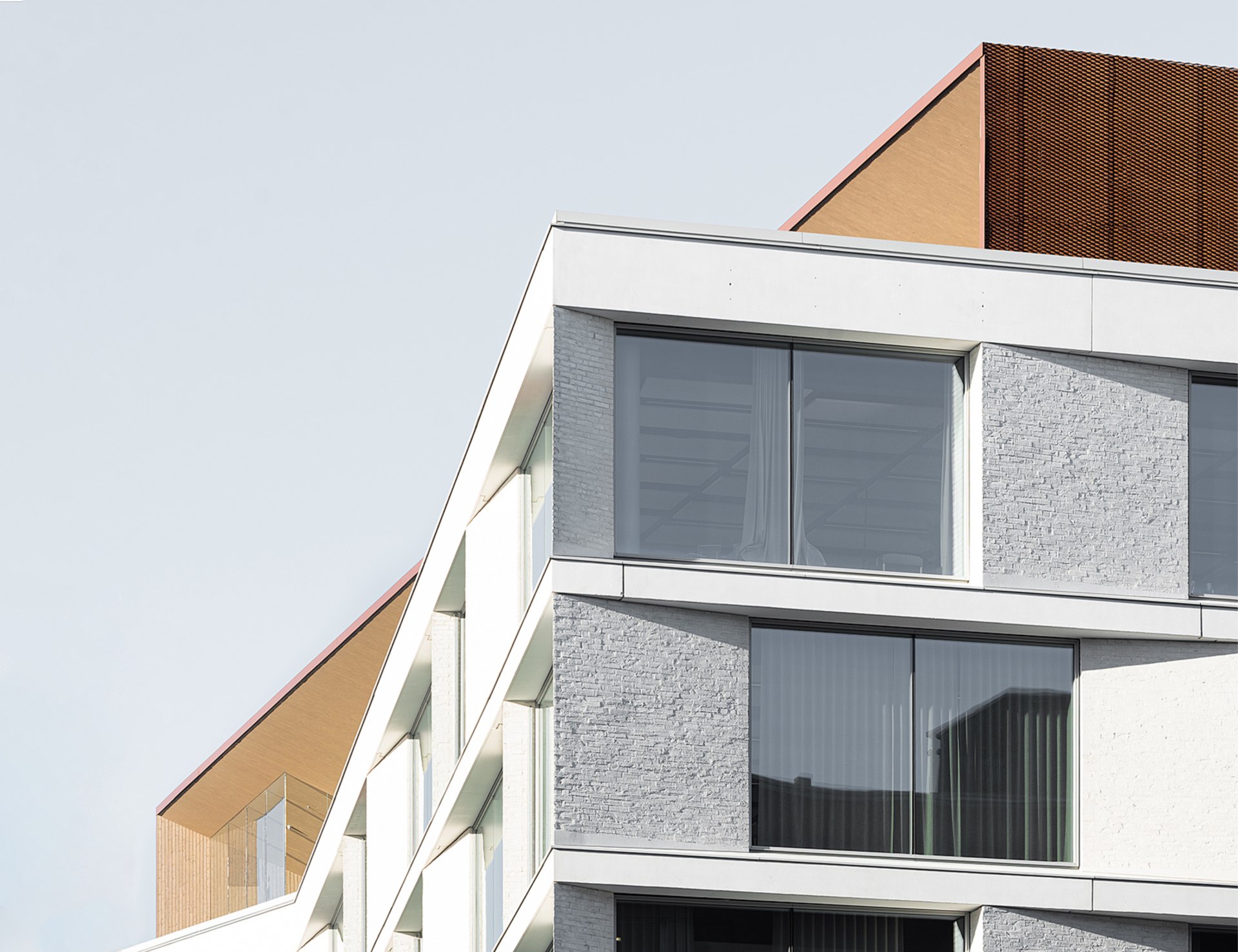
The timeless quality of the architecture and its pared down clarity continues inside the building where the emphasis is on the well-being of the staff.
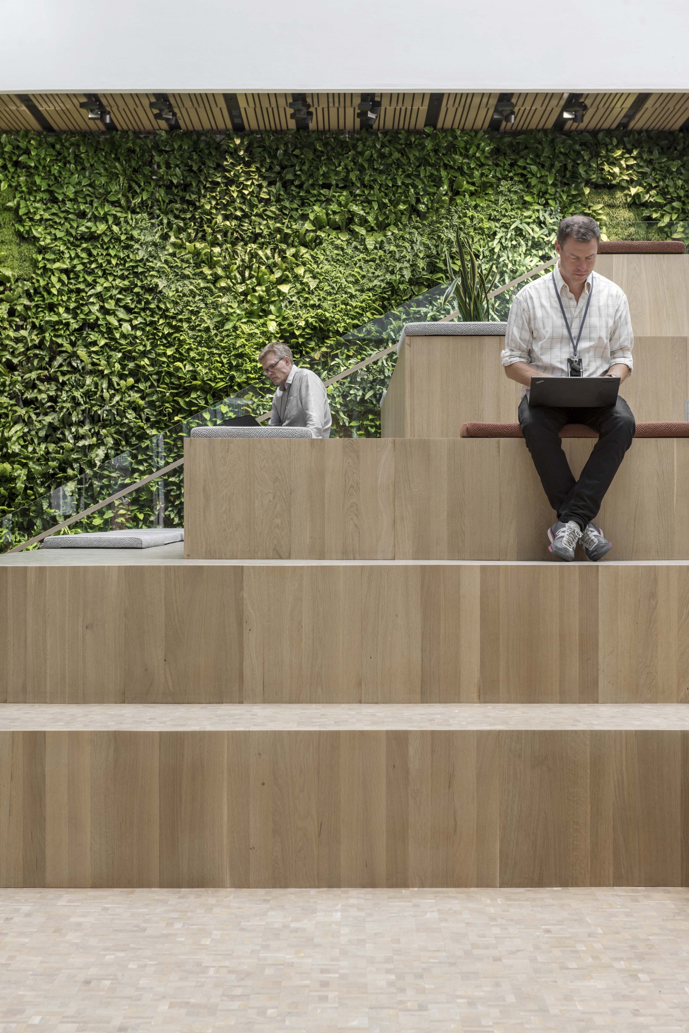
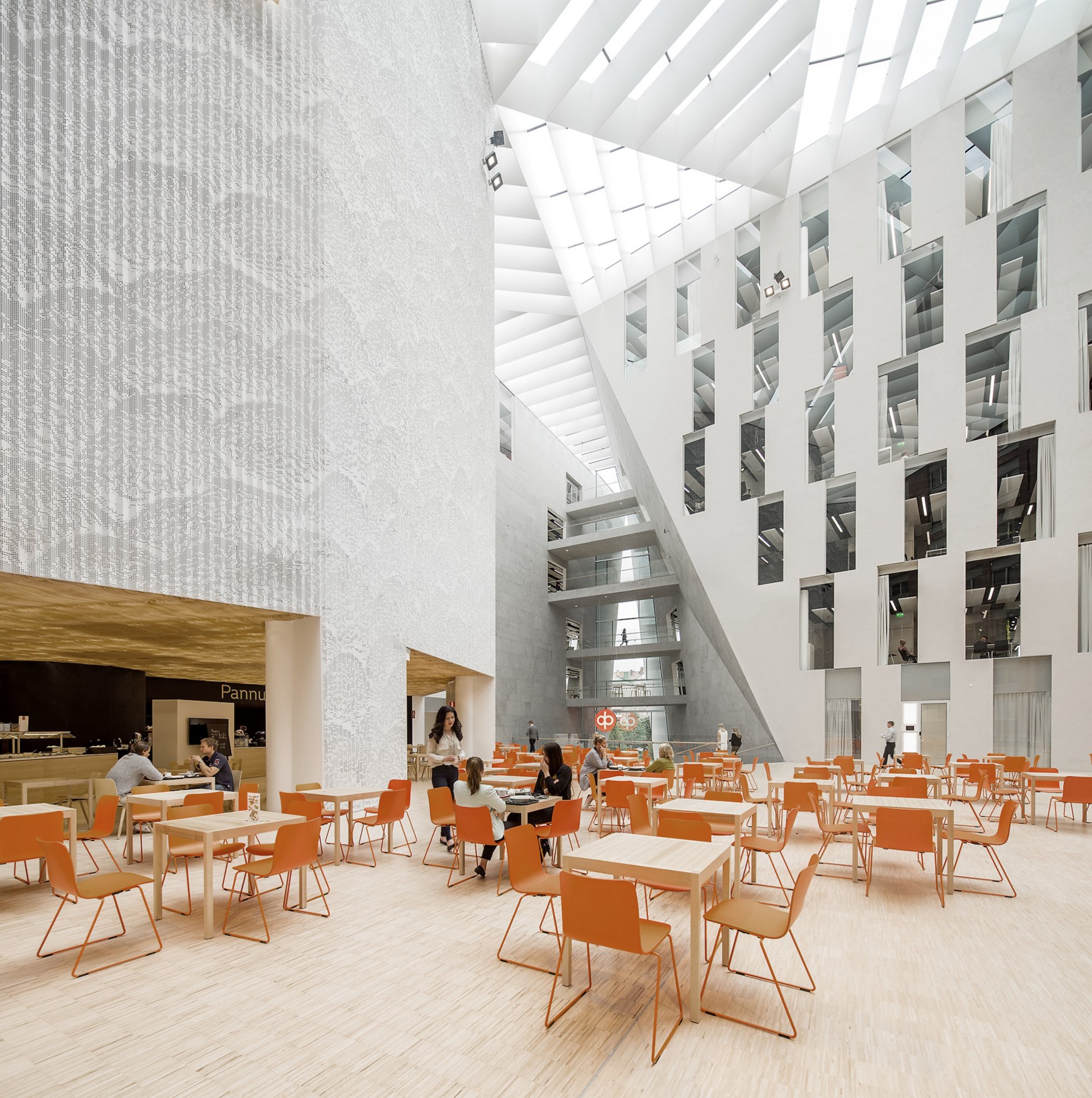
The main entrance opens onto the central atrium, public cafe and conference rooms which can be closed off behind partitions. The atrium courtyard is bathed in natural light that works well with the natural timber surfaces, the verdant green wall and the use of glass. At the heart of the space is a auditorium like stepped seating area and large staircase that double up as an active space for working; in much the same way, all of the building’s interior areas do.
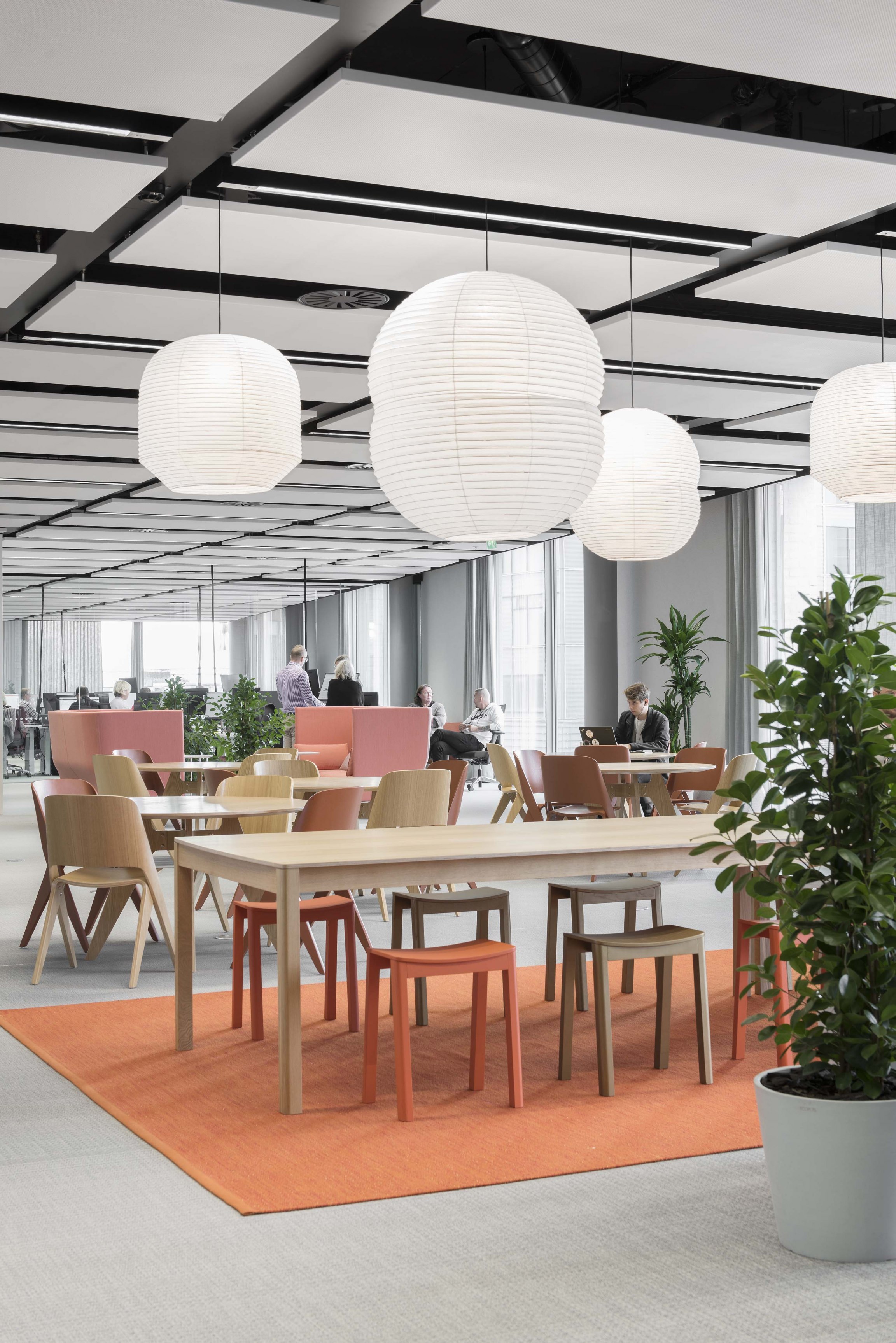
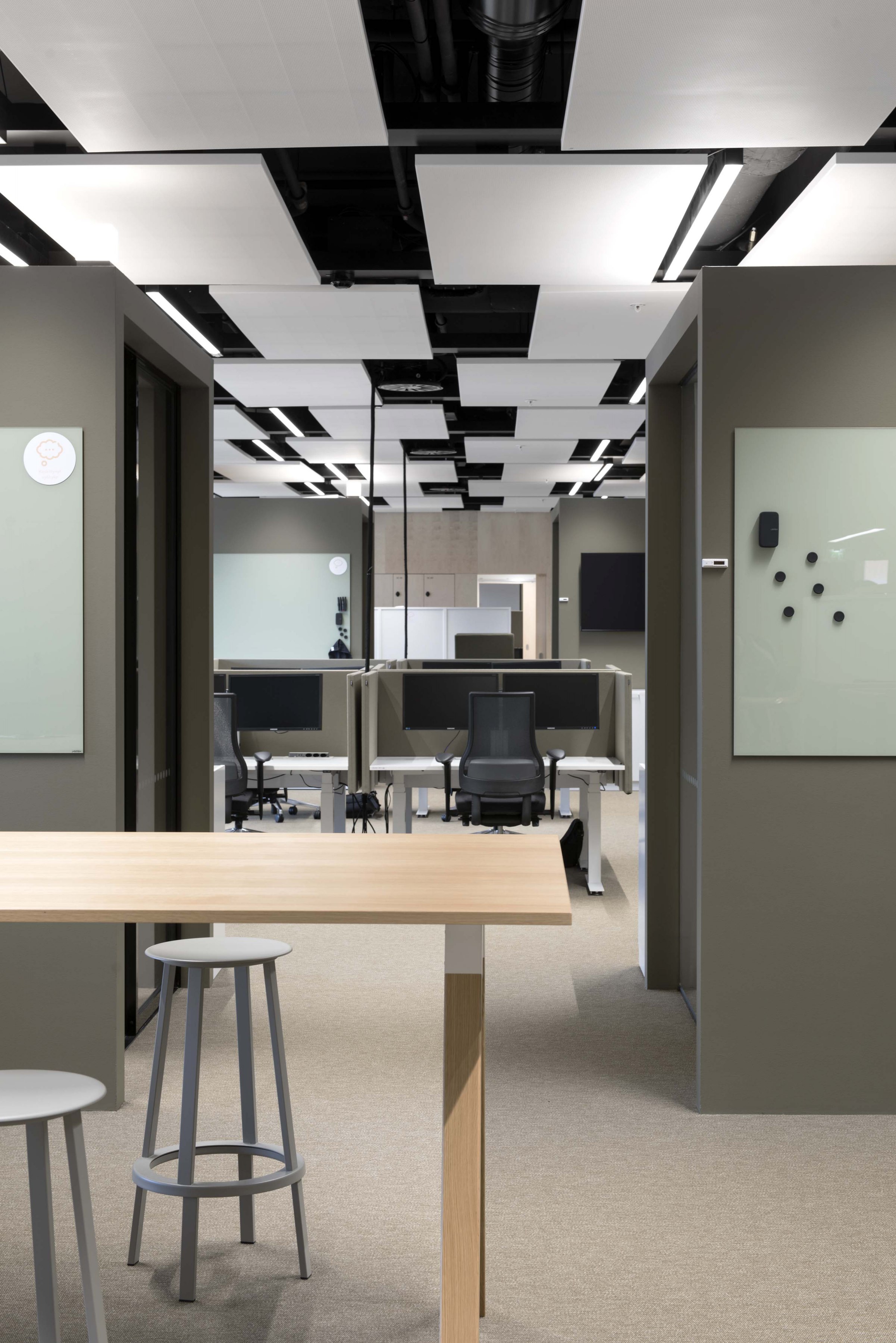
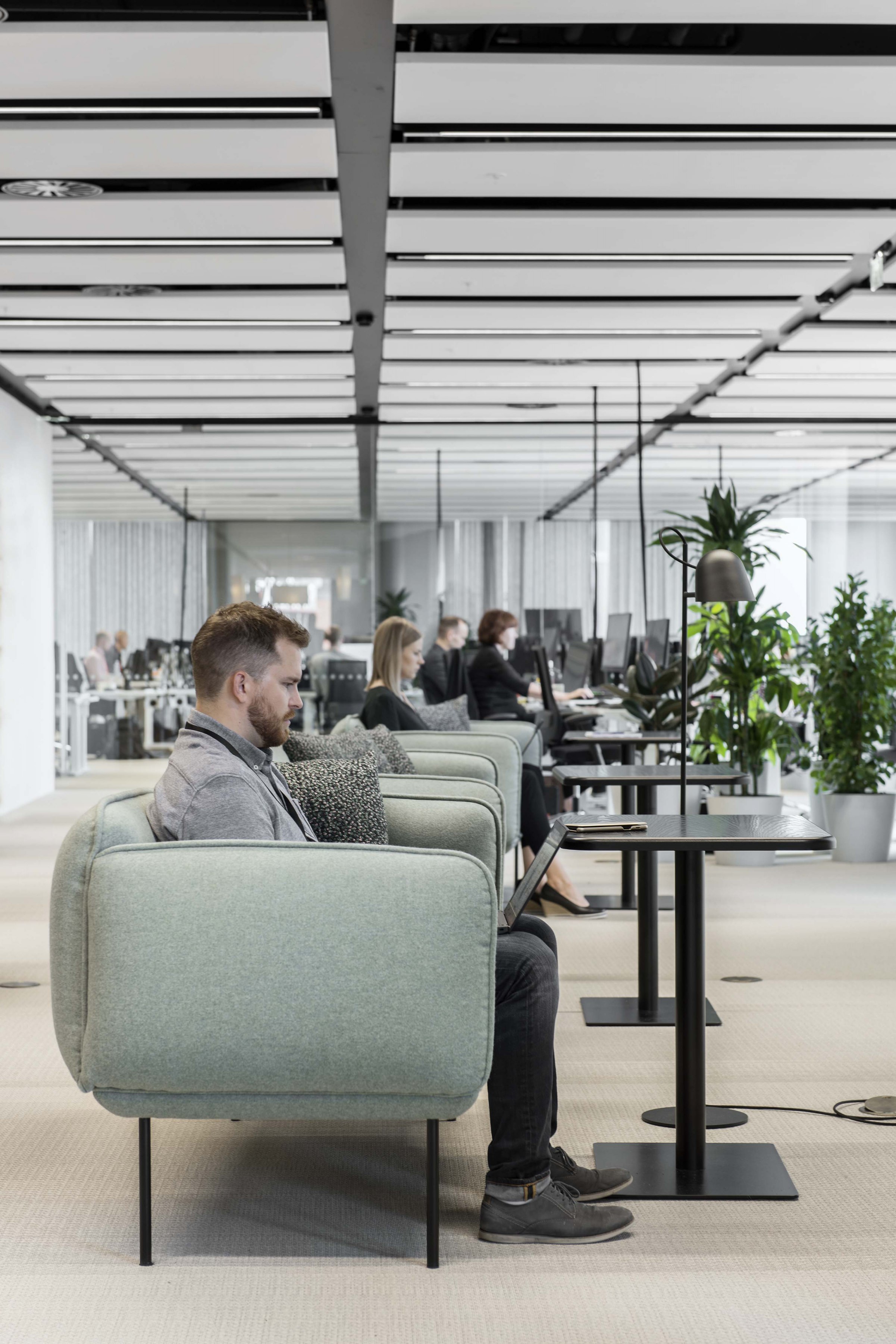
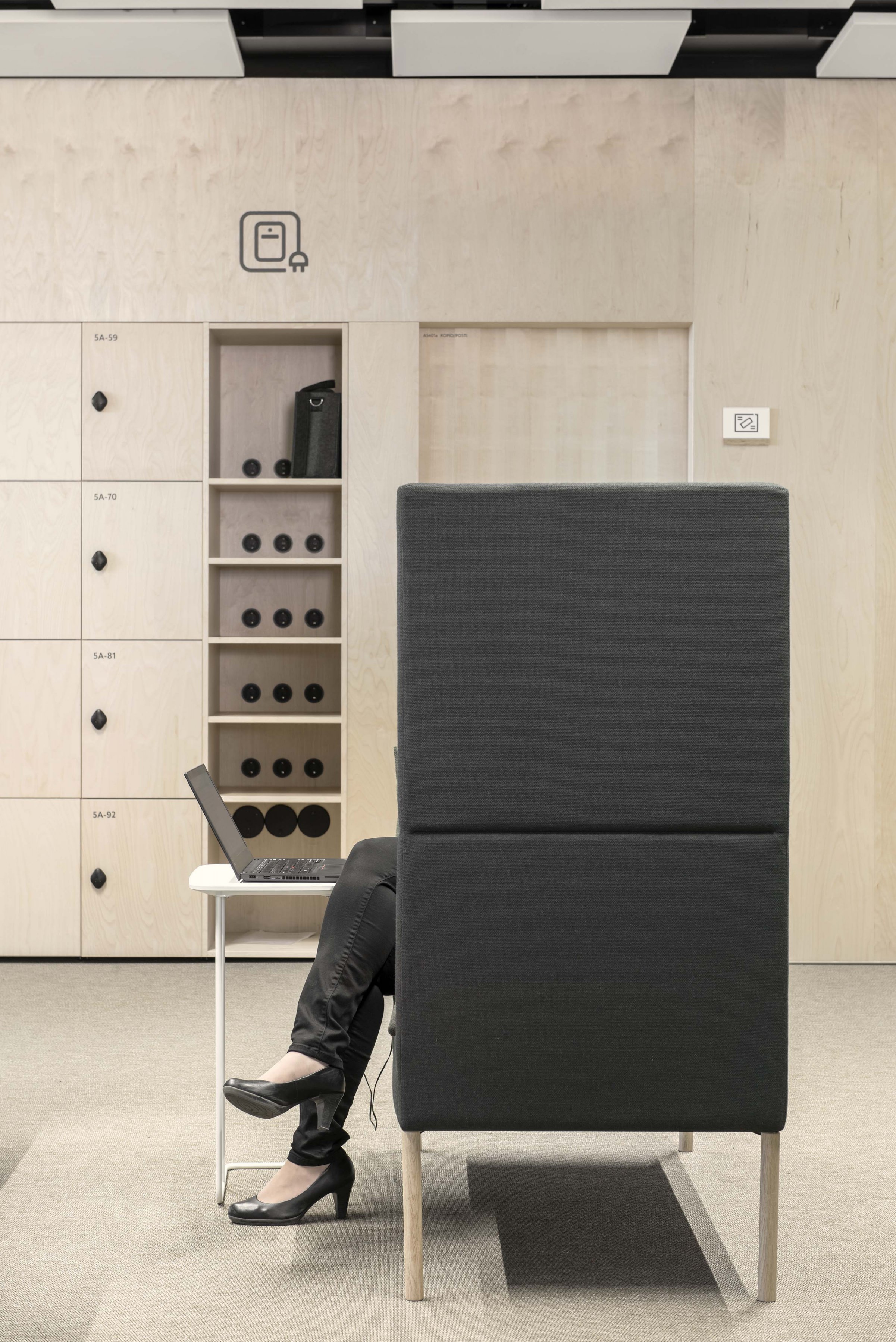
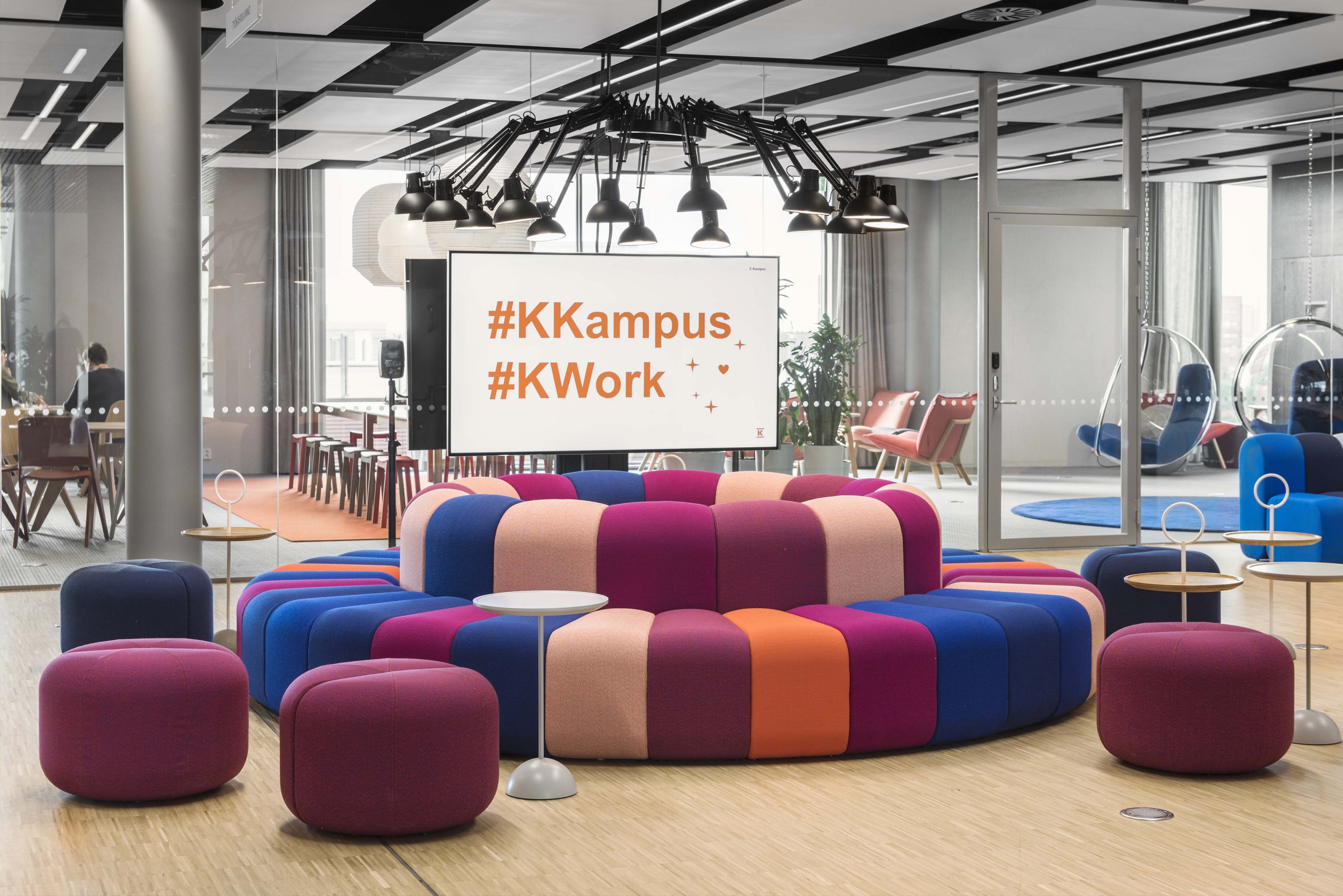
The stairs lead to the four dedicated office floors and meeting rooms that wrap around the atrium. Each of which are “futureproofed” ensuring flexibility in how they are used. Their design lends themselves to different methods of working within the same space and collaboration between Kesko’s different teams. The design strategy emphasises that all spaces are open and can be used effectively as work stations by staff. This is a move away from a more traditional approach to working only at one’s own desk. Instead, at K-Kampus, the overall fitout right down to IT points, power supplies and lighting solutions ensures that itinerant working practices are fully supported.
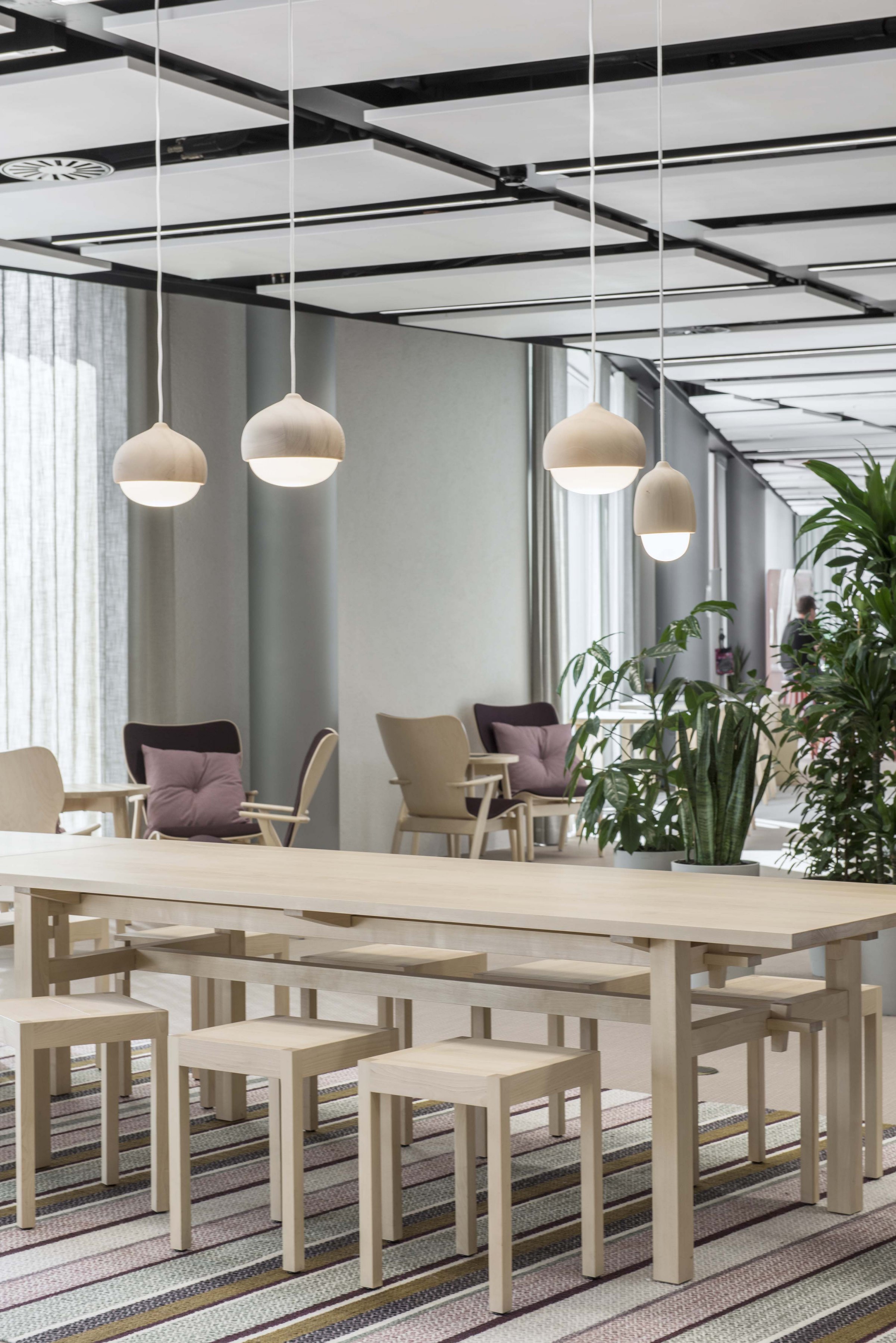
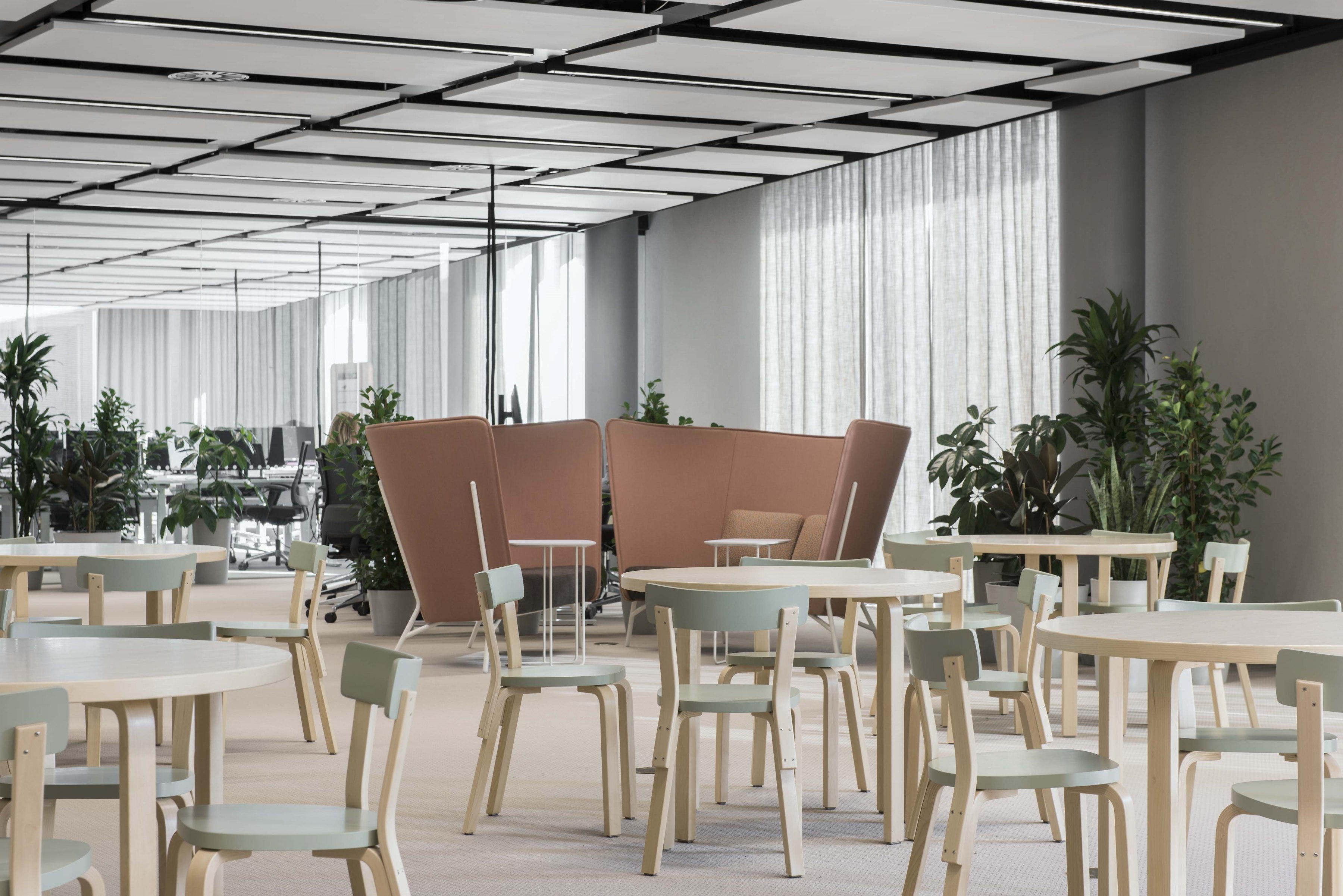
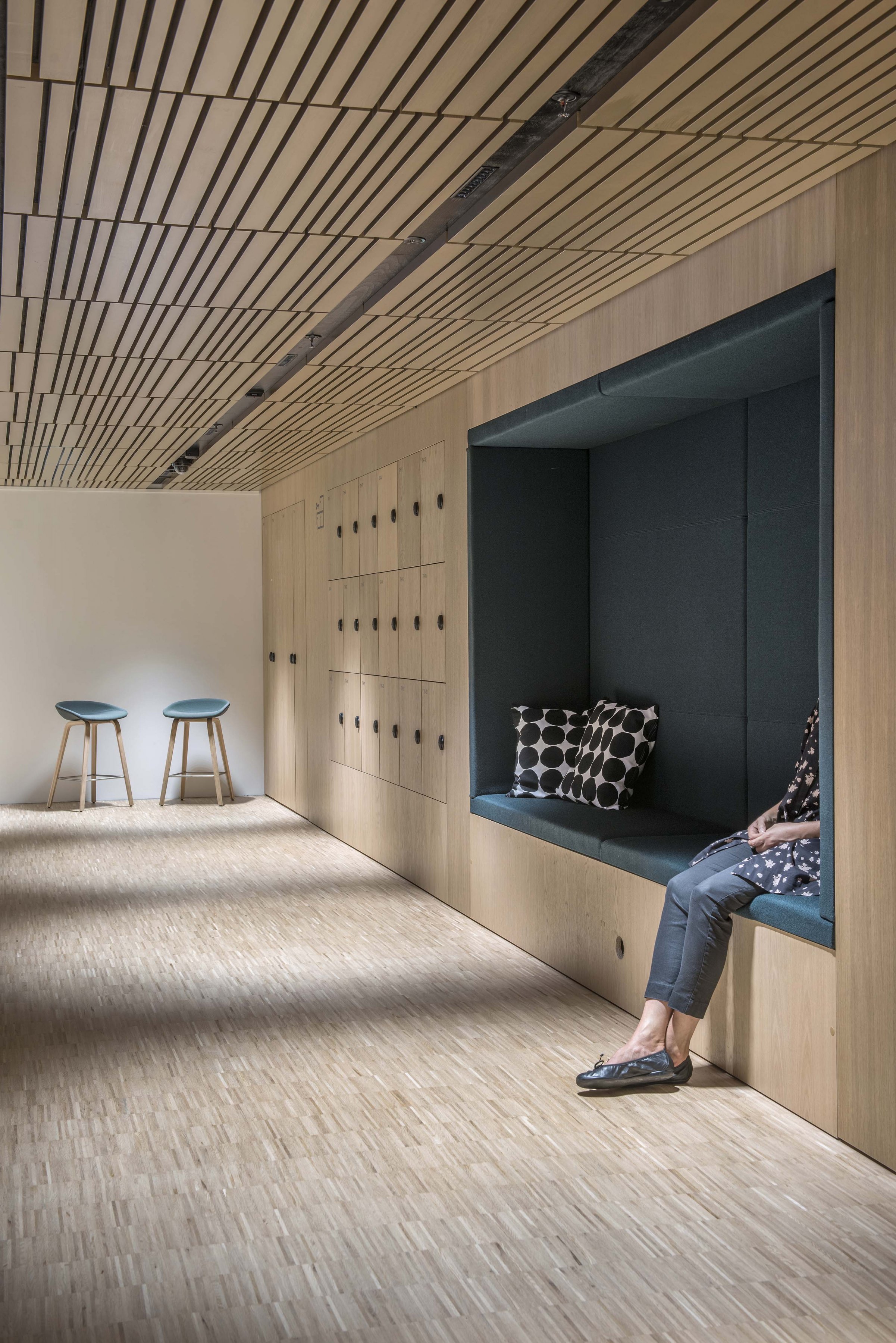
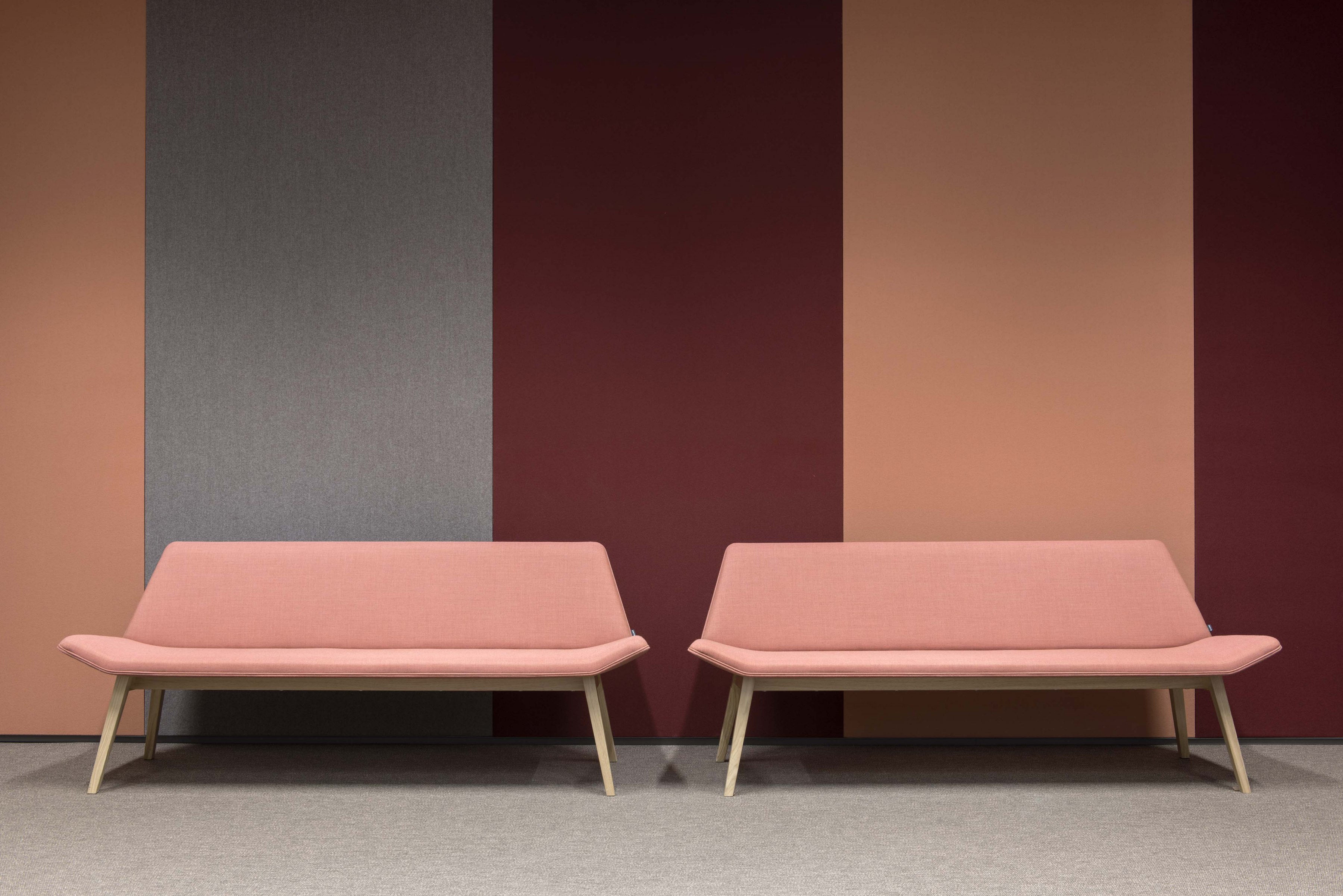
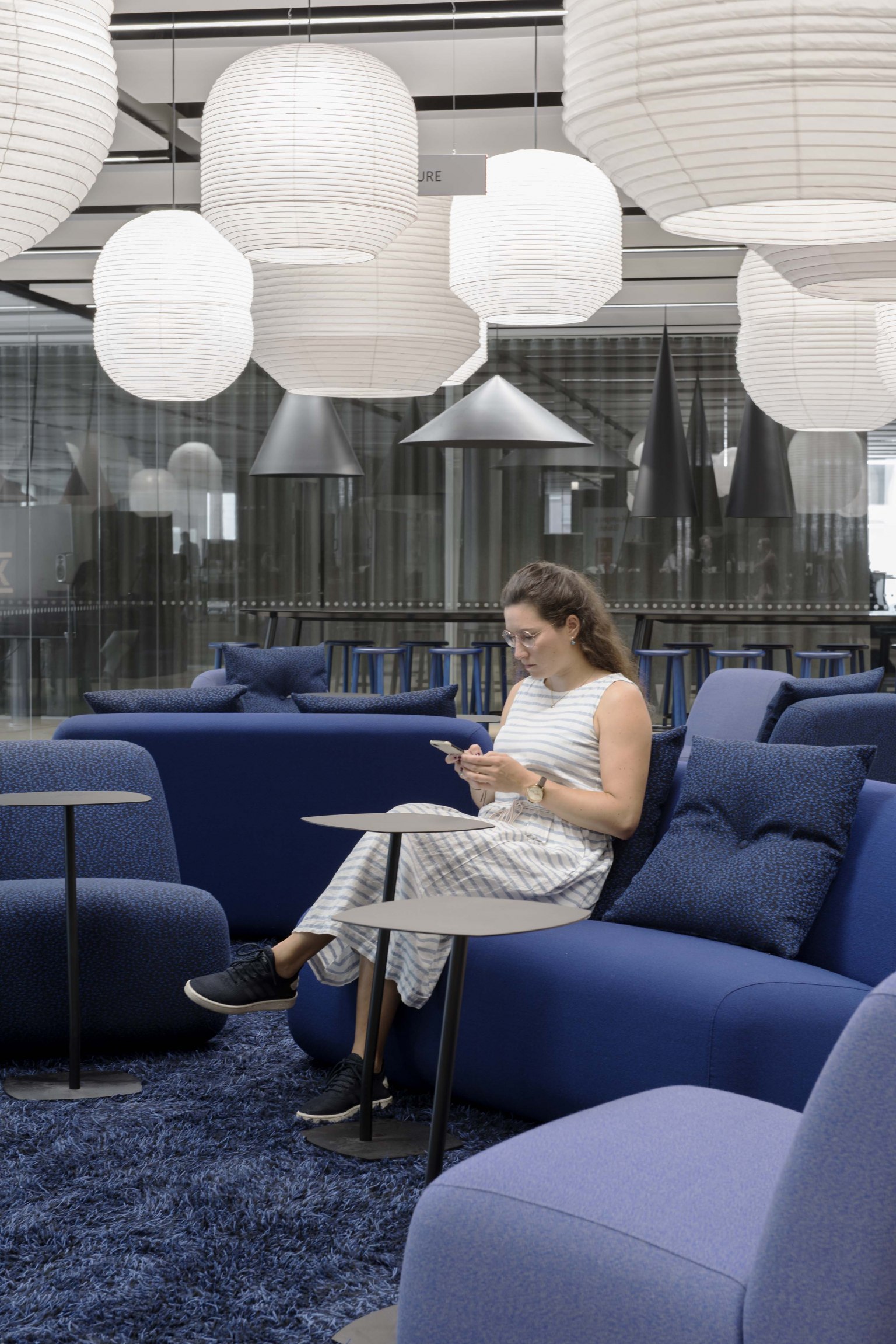
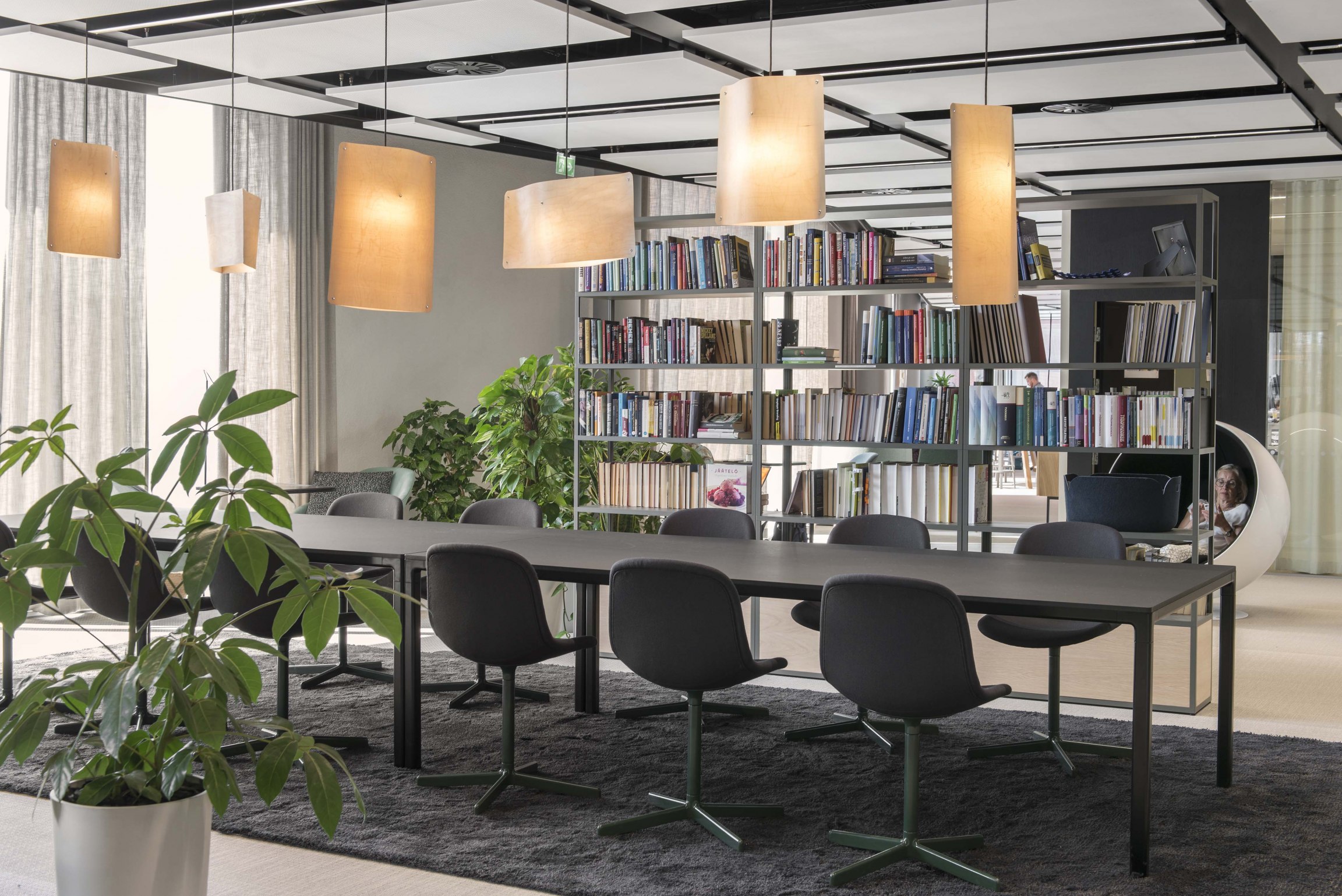
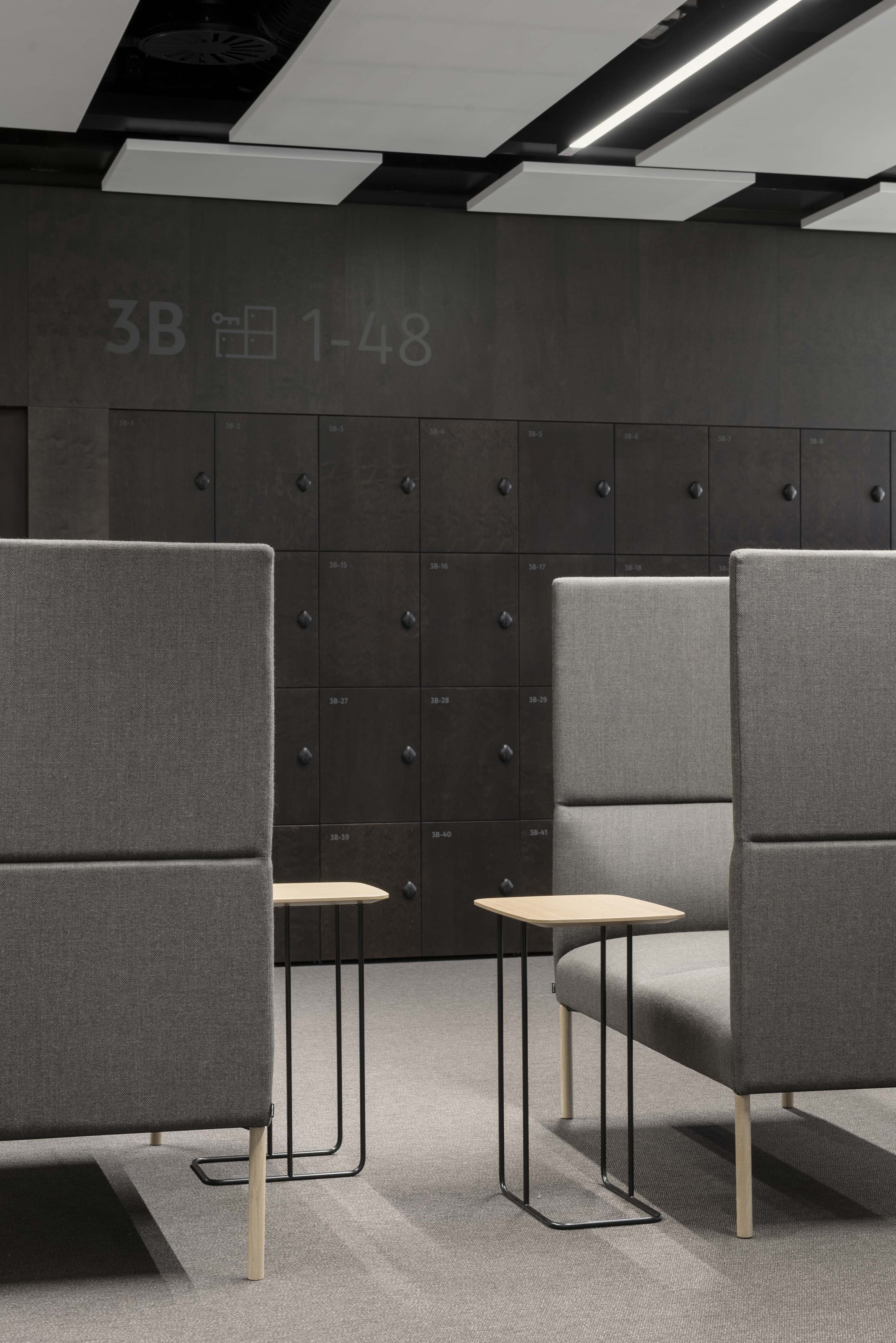
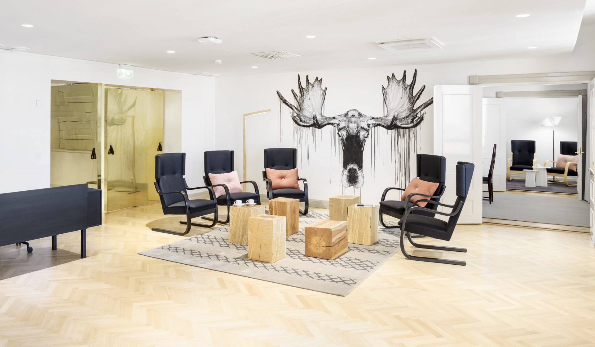
The aim has been to create a work-spaces that are inviting by feeling both warm and welcoming. Each level has its own “stamp”, apparent in the distinct furniture as well as colour and material palette that varies from floor to floor. Comfort, coziness and a soft and sensuous feel have been important considerations in selecting the interior materials. Plants also play a big role in the interiors. The interior lighting scheme combines both ambient local lights with large numbers of spot lights.
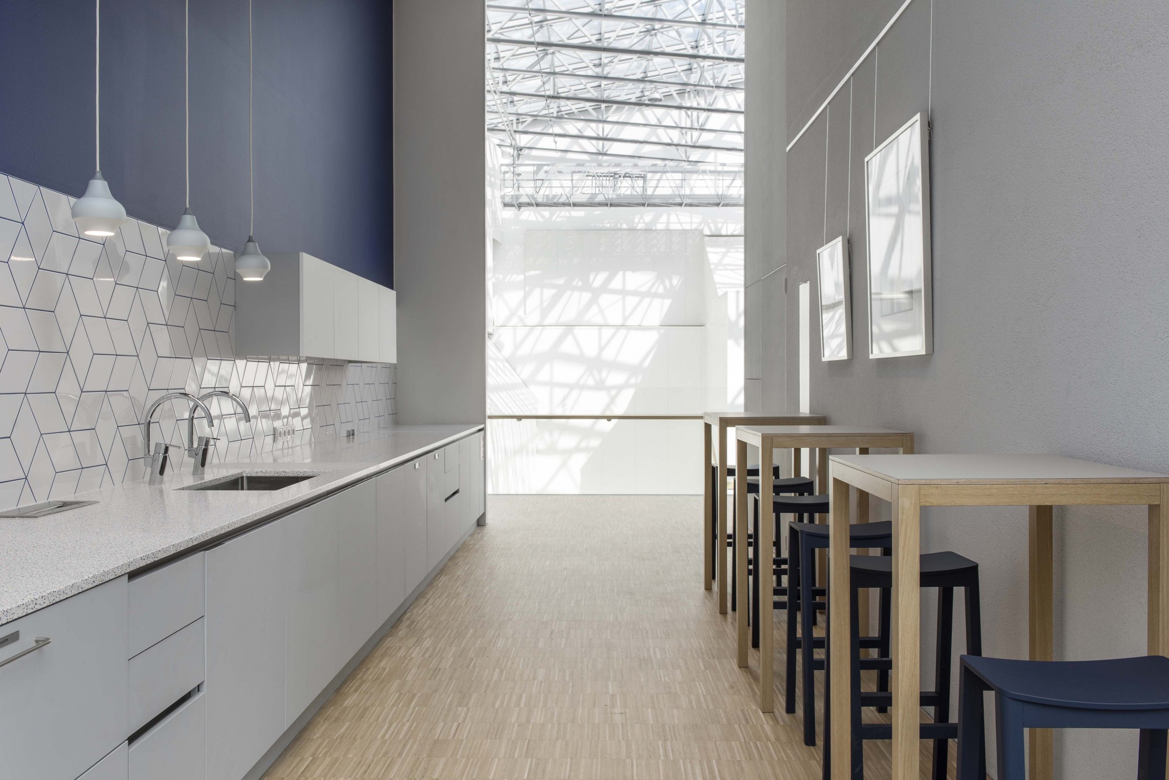
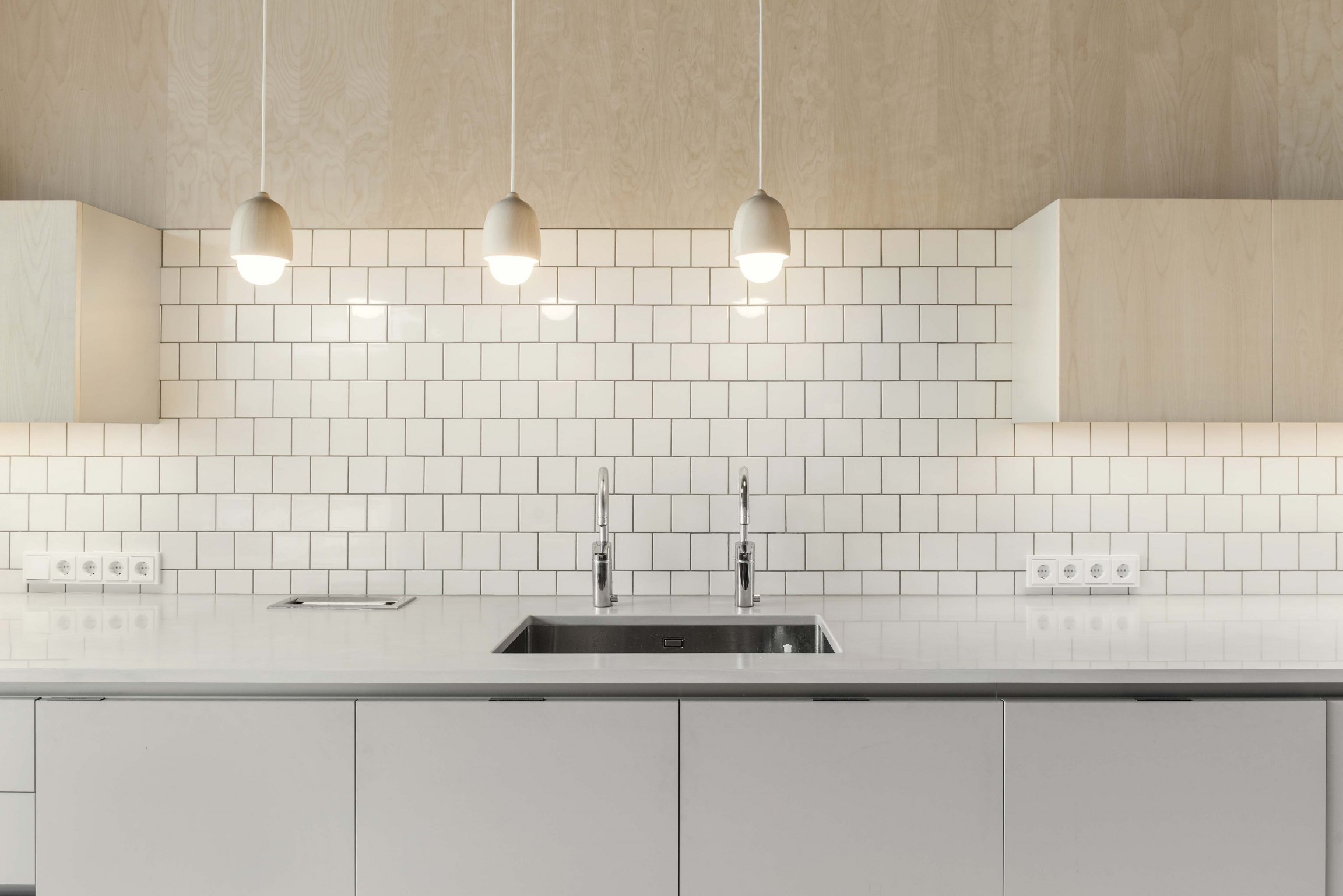
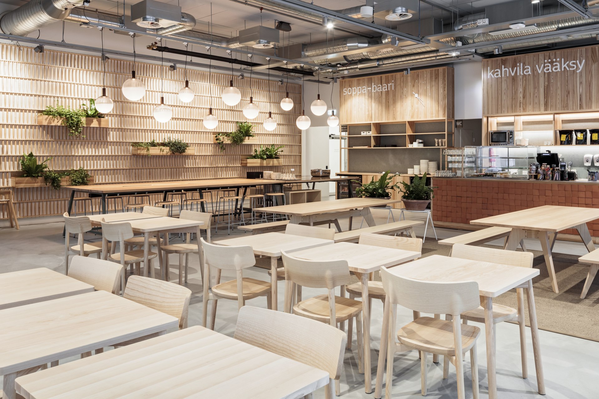
Acoustics and pleasurable work-spaces have been another focus. Each floor has meeting rooms with break out spaces which include office kitchens. There are work cafés too on the different levels intended as meeting places as well as alternative work-spaces. As the cafés have been positioned near meeting rooms, they readily serve visitors to K-Kampus.
The office floors are divided into zones defined by the needs of staff. There are zones tailored for collaborative working, zones more suited for meetings and those that focus on solitary working practices. The meeting rooms intended for visitors face the atrium courtyard. These open onto generous huddle spaces can be closed off as required. The solitary work-spaces are displaced amongst the other spaces so that they pace the character of the floor plan by introducing quiet and calm areas amongst busier and more lively ones. All in all, there are over 100 meeting points amongst the variety of work-spaces at K-Kampus.
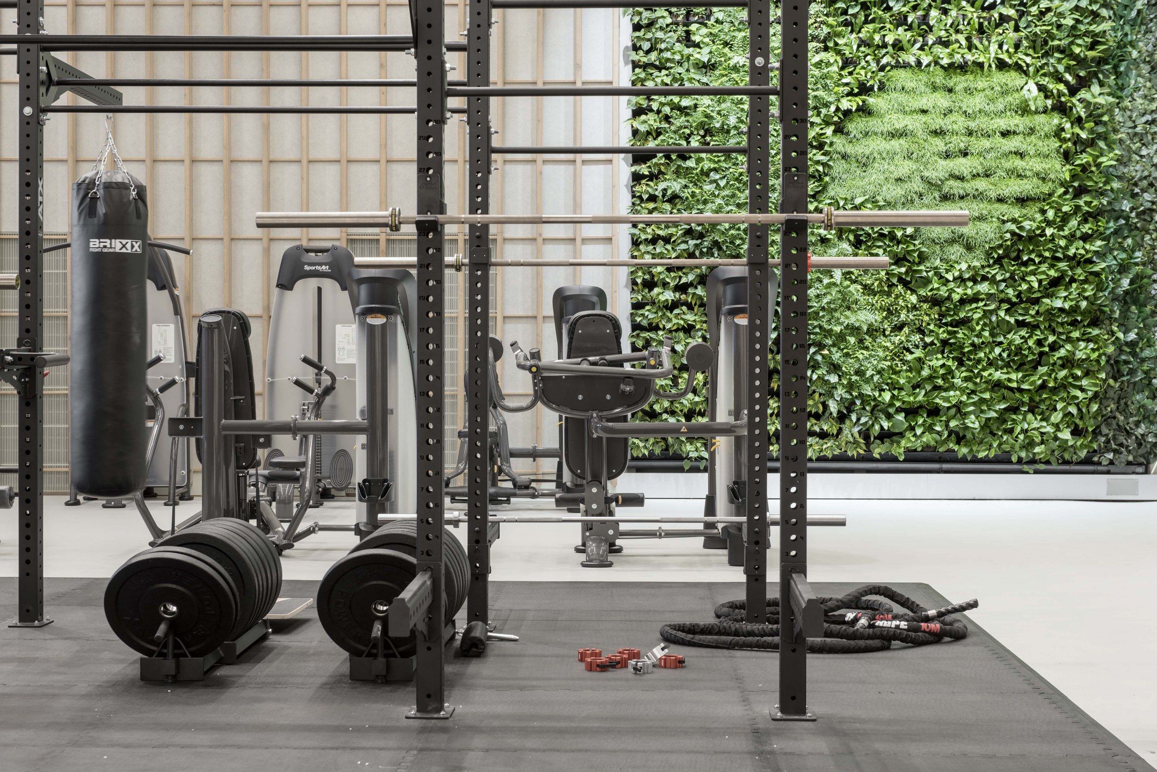
JKMM was responsible not only for the main architectural design but also for the multi-space work environment concept and interior design, including versatile work-spaces, meeting areas, event spaces, showrooms, wellness facilities and product research laboratories.
(The interior design of the street-level entrance lobby, café, media and studio spaces, and the second-floor staff restaurant was handled by dSign).
